Petrus Gerardus Vertin (1819-1893) - Hollands Straatje (NO RESERVE)


08
days
01
hour
02
minutes
51
seconds
Current bid
€ 72
No reserve price

Expert
Selected by Leo Setz
Over 30 years’ experience as art dealer, appraiser and restorer.
Estimate € 500 - € 600
43 other people are watching this object
 Bidder 6375 Bidder 6375 | €72 | |
|---|---|---|
| Bidder 5281 | €65 | |
| Bidder 6375 | €65 | |
Catawiki Buyer Protection
Your payment’s safe with us until you receive your object.View details
Trustpilot 4.4 | 123779 reviews
Rated Excellent on Trustpilot.
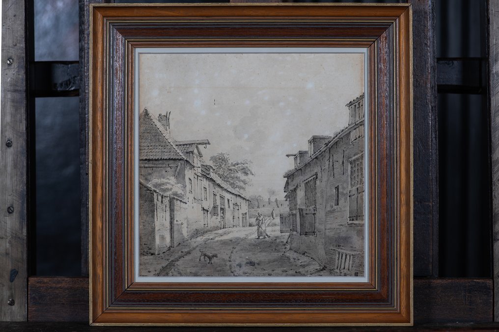
Petrus Gerardus Vertin’s Hollands Straatje (1840) is a mixed‑technique on paper Dutch cityscape in Romantic 19th‑century style, with a framed overall size of 39 × 39.5 cm and visible artwork of 27 × 27 cm, hand‑signed on the back and in reasonable condition with foxing visible under UV.
AI-assisted summary
Description from the seller
Petrus Gerardus Vertin (1819–1893)
Holland's Little Street
Mixed technique on paper (pencil/graphite and black ink/watercolor)
Visible work approximately 27 × 27 cm; including frame approximately 39 × 39.5 cm.
Romanticism (nineteenth-century Dutch street and cityscape views)
Hand-signed verso and dated 1840; signature visible via the reverse side.
Condition: discoloration and foxing; clearly visible under UV; framed with a passe-partout and thick glass, also visible from the back behind the glass.
Introduction
This work by Petrus Gerardus Vertin presents a tranquil, observant view of a Dutch street, executed with an remarkable sense of perspective, architectural characterization, and atmosphere. The early dating (1840) places the sheet in a phase where the artist shapes his handwriting: precise in line work, controlled in tone, and effective in suggesting space. The result is an intimate street view that relies not on spectacle but on mood, rhythm, and the recognizable character of Dutch architecture.
The visual story
The viewer looks down a street that opens slightly towards the back. On the left and right, houses and sheds flank the route, with pronounced rooflines, simple facades, and shutters that act as visual 'anchors' in the central plan. In the street itself, two small figures are present: one closer, holding a broom or rake, and further back, a second figure that activates the background. In the foreground, a dog walks, a subtle but important detail that humanizes the scene and keeps the scale understandable.
What makes the depiction convincing is the combination of calm and liveliness: the scene is peaceful but not static. The street surface with traces and texture, the interplay of shadow and light on the facades, and the small figures that 'measure' the space give the whole a credible, everyday presence. This is precisely the domain where nineteenth-century romantic artists excelled: elevating the everyday to a carrier of emotion and sense of time.
Technique and construction
The sheet is executed in mixed technique, where pencil/graphite and black ink functionally complement each other.
1. Pencil/graphite as tone and foundation.
With graphite, soft shadows and tone fields are applied: the street, the facades, the roof sections, and the sky. Graphite is ideally suited to suggest depth with minimal means: closer areas typically have stronger tone contrast; towards the back, the values become lighter and more uniform, thereby naturally enhancing the perspective.
Black ink as structure and accent
The ink line clarifies edges, joints, window frames, and structural elements. Especially in architecture, this helps to enhance 'readability': the viewer immediately understands how a facade is constructed, where the shutters hinge, and how the roof edge runs. Additionally, the ink gives the work a graphic crispness characteristic of artists who are also familiar with print techniques such as etching or lithography.
Hatching and material impression
Door arches and short strokes create a suggestion of texture: roof tiles, rough masonry, wooden shutters, street dirt, and muddy tracks. These are not excessive details but selective cues. Vertin chooses where he adds 'information' and where he allows space to breathe, maintaining an elegant balance between description and atmosphere.
Color palette and lighting effects
Because the work was executed in monochrome media, the palette unfolds within a spectrum of grays and black, softened by the warm base tone of the paper. That limitation is an advantage here: attention is drawn to composition, light, and rhythm.
The sky is kept relatively calm; as a result, the architecture gains more weight and the volumes appear more solid. The light is diffuse, as if it were a cloudy day. This produces an even, soft shadow effect, without harsh contrasts. This choice perfectly aligns with the romantic pursuit of mood: not the bright sunlight, but the subdued 'northern' light that gently softens the surroundings.
Composition and perspective
The composition is carefully constructed around a few classical principles.
Guiding principle
The street functions as a natural leading line that draws the viewer's eye into the image. The curve or subtle bend in its course prevents the scene from appearing flat; it creates a sense of 'around the corner' and thus of continuation beyond the frame.
Flanking masses
The buildings on the left and right form a corridor. On the left is the silhouette of the roof, while on the right stands a larger facade mass with shutters and windows that provide a counterbalance. Together, they frame the central plan and emphasize the vanishing point.
Scale and human measure
The figure with the tool and the dog are crucial for scale. Without these 'measures,' the buildings could become abstract; with these small elements, the street immediately feels human and credible.
Depth through tone reduction
In the background, tones become lighter and details more sparing. This is a proven way to suggest atmospheric perspective, even in black and white.
Stylistic placement within art history
This sheet fits within nineteenth-century romanticism and the Dutch tradition of topographical and picturesque scenes. In the Netherlands, there is a long line of artists and painters who approach the urban or village motif as a combination of documentation and poetry. Vertin is considered part of this tradition as an artist who does not render the topographical merely dryly, but 'embodies' it with light, texture, and small narrative cues.
Within romanticism, the picturesque is a core concept: the charming, irregular, and historically evocative street scene that invites observation and remembrance. This work possesses that quality through its sober architecture, shutters, street layout, and the tranquil human presence.
Some related style matches (no further explanation, comma-separated):
Cornelis Springer, Bartholomeus Johannes van Hove, Johannes Bosboom, Canaletto, Bernardo Bellotto
The artist: position and background
Petrus Gerardus Vertin (1819–1893) is mainly known for city and street views and landscapes, with a clear affinity for architecture and perspective. He is connected to The Hague, where he also studied at the Royal Academy of Art. Broadly speaking, his work aligns with the nineteenth-century interest in the 'own' urban and landscape heritage: recognizable, sometimes topographically inspired, and often emphasizing atmosphere.
Important for this specific piece is that it is early dated. A date like 1840 is not just a year; it is a context: a moment when the artist's hand visibly develops, and when the combination of drawing skill and compositional awareness can already be mature. This makes early, dated works often attractive to collectors because they are convincing both aesthetically and documentarily.
Signature and dating
The hand-signed mention and the dating on the back are an essential part of the object. That the back is kept visible (behind thick glass) is more than a practical choice: it makes the signature and any notes or studio information part of the presentation and increases transparency for the buyer.
Paper condition and UV observation
The work shows discoloration and foxing. Foxing is a common phenomenon in historical paper works: brown specks or spots that can vary visually from subtle to clearly visible. Under UV light, this type of condition is usually more apparent, and in this case, it is explicitly mentioned that it is visible under UV.
It is important to emphasize that this type of condition feature is common in works on paper from the nineteenth century, especially when they have been preserved over time under varying climate conditions. In a catalog context, this is usually clearly noted, as here, so that the buyer can assess the condition.
List, mat, and presentation.
The work is presented in a wooden frame with veneer finish, with a passe-partout and thick glass. The passe-partout provides visual calm and creates distance between paper and glass, which can be aesthetically and conservationally relevant. The fact that both the front and back are visible behind glass gives the object a quasi-museum presentation: not only the image but also the 'material truth' of the work (support, notes, signature) becomes part of the experience.
Collectors' value and attractiveness
This work unites several qualities that resonate well in a premium auction context.
A recognizable, timeless Dutch motif with a strong atmospheric value.
• a convincing graphic execution with clear architectural mastery
Early dating that further positions the sheet within the oeuvre.
• Transparent condition information including UV indication
Well-presented with a visible signature on the back.
For collectors of 19th-century Dutch romanticism, Hague drawing art, and cityscape and street views, this is an attractive, intimate work that effortlessly fits into both classical and modern interiors.
No Reserve
Offered without a minimum price. A characterful, early dated work on paper by Petrus Gerardus Vertin, depicting the picturesque Dutch street scene with restrained means and convincing spatiality.
The work 'Hollands Straatje' is a stylish wooden frame with veneer finish, with glass on the front and back sides, in passe-partout.
Total dimensions: 39x39.5cm
Visible artwork dimensions: 27x27cm
All shipments are sent in professional packaging via FedEx, DPD, or PostNL.
For all shipments, a surcharge for packaging material applies, which is already included in the stated shipping price.
Shipping artworks always carries certain risks. While shipping is possible, we recommend collecting the artwork in person when this option is available. If shipping is chosen, this is entirely at the buyer's risk. Collection ensures that the artwork will be received undamaged and in perfect condition. After purchase, you can easily schedule an appointment to collect the artwork from our workshop and studio, where it will be safely and carefully prepared for you.
Transport quotation request via our website (Service-transport) or via Catawiki support.
When purchasing this artwork, you have the option to have it delivered with or without a frame. The frame, richly decorated and matching the artwork, is offered free of charge so you can hang the painting immediately. Although we take utmost care in professional packaging and shipping, there is a small risk of damage to the frame or glass during transport. Any damage to the frame or glass that does not affect the artwork itself will not be accepted as a valid reason for a claim or cancellation. We recommend collecting the artwork in person or arranging your own transportation, as damage to the frame, especially the plaster ornaments, will not be covered.
We aim to deliver your artwork to you safely and in optimal condition, paying careful attention to packaging and the shipping process. If you have any questions or special requests, you can always contact Catawiki customer service.
The customer is responsible for any customs duties and additional costs that may apply upon delivery abroad.
From the moment your purchase is confirmed, we treat each shipment as an individual project. Each painting is carefully packed with high-quality, professional shipping materials, and we select the most suitable carrier based on destination, transit time, and handling requirements. We monitor each package closely until delivery is completed.
Since no two artworks are the same, we often create custom-made, handmade shipping containers or boxes tailored to the size, framing, and fragility of the painting, as well as the distance and transport conditions to your address. This guarantees the best possible protection throughout the entire journey.
To support a smooth international shipping process, we prepare the correct documents and shipping documentation, including customs codes and export-related information if necessary.
In some cases, we proactively contact you to confirm that your package has arrived safely, that the painting is in good condition, and to answer any questions you may have.
We usually call the phone number provided to Catawiki, and this conversation will be in English.
If desired, you can also reach us via email or through the Catawiki chat.
Seller's Story
Welcome to Vandenberg Fine Art BV on Catawiki.
Vandenberg Fine Art BV specializes in painting from the 15th through the 19th century, with a particular focus on Dutch, Flemish, and Italian masters. Our carefully curated collection comprises high-quality artworks distinguished by their artistic merit, authenticity, and historical significance.
Our offering includes works by leading artists of the Dutch and Flemish schools, as well as important representatives of the Italian Renaissance and Baroque. Each artwork is selected with expertise and care, with close attention paid to condition, provenance, and art-historical relevance.
At Vandenberg Fine Art, reliability and transparency are fundamental values. We provide detailed descriptions, high-quality images, and thoroughly conducted provenance research. Our aim is to support both experienced collectors and emerging art enthusiasts in making well-informed decisions.
Explore our exclusive collection and experience the rich history and enduring beauty of classical painting.
Translated by Google TranslatePetrus Gerardus Vertin (1819–1893)
Holland's Little Street
Mixed technique on paper (pencil/graphite and black ink/watercolor)
Visible work approximately 27 × 27 cm; including frame approximately 39 × 39.5 cm.
Romanticism (nineteenth-century Dutch street and cityscape views)
Hand-signed verso and dated 1840; signature visible via the reverse side.
Condition: discoloration and foxing; clearly visible under UV; framed with a passe-partout and thick glass, also visible from the back behind the glass.
Introduction
This work by Petrus Gerardus Vertin presents a tranquil, observant view of a Dutch street, executed with an remarkable sense of perspective, architectural characterization, and atmosphere. The early dating (1840) places the sheet in a phase where the artist shapes his handwriting: precise in line work, controlled in tone, and effective in suggesting space. The result is an intimate street view that relies not on spectacle but on mood, rhythm, and the recognizable character of Dutch architecture.
The visual story
The viewer looks down a street that opens slightly towards the back. On the left and right, houses and sheds flank the route, with pronounced rooflines, simple facades, and shutters that act as visual 'anchors' in the central plan. In the street itself, two small figures are present: one closer, holding a broom or rake, and further back, a second figure that activates the background. In the foreground, a dog walks, a subtle but important detail that humanizes the scene and keeps the scale understandable.
What makes the depiction convincing is the combination of calm and liveliness: the scene is peaceful but not static. The street surface with traces and texture, the interplay of shadow and light on the facades, and the small figures that 'measure' the space give the whole a credible, everyday presence. This is precisely the domain where nineteenth-century romantic artists excelled: elevating the everyday to a carrier of emotion and sense of time.
Technique and construction
The sheet is executed in mixed technique, where pencil/graphite and black ink functionally complement each other.
1. Pencil/graphite as tone and foundation.
With graphite, soft shadows and tone fields are applied: the street, the facades, the roof sections, and the sky. Graphite is ideally suited to suggest depth with minimal means: closer areas typically have stronger tone contrast; towards the back, the values become lighter and more uniform, thereby naturally enhancing the perspective.
Black ink as structure and accent
The ink line clarifies edges, joints, window frames, and structural elements. Especially in architecture, this helps to enhance 'readability': the viewer immediately understands how a facade is constructed, where the shutters hinge, and how the roof edge runs. Additionally, the ink gives the work a graphic crispness characteristic of artists who are also familiar with print techniques such as etching or lithography.
Hatching and material impression
Door arches and short strokes create a suggestion of texture: roof tiles, rough masonry, wooden shutters, street dirt, and muddy tracks. These are not excessive details but selective cues. Vertin chooses where he adds 'information' and where he allows space to breathe, maintaining an elegant balance between description and atmosphere.
Color palette and lighting effects
Because the work was executed in monochrome media, the palette unfolds within a spectrum of grays and black, softened by the warm base tone of the paper. That limitation is an advantage here: attention is drawn to composition, light, and rhythm.
The sky is kept relatively calm; as a result, the architecture gains more weight and the volumes appear more solid. The light is diffuse, as if it were a cloudy day. This produces an even, soft shadow effect, without harsh contrasts. This choice perfectly aligns with the romantic pursuit of mood: not the bright sunlight, but the subdued 'northern' light that gently softens the surroundings.
Composition and perspective
The composition is carefully constructed around a few classical principles.
Guiding principle
The street functions as a natural leading line that draws the viewer's eye into the image. The curve or subtle bend in its course prevents the scene from appearing flat; it creates a sense of 'around the corner' and thus of continuation beyond the frame.
Flanking masses
The buildings on the left and right form a corridor. On the left is the silhouette of the roof, while on the right stands a larger facade mass with shutters and windows that provide a counterbalance. Together, they frame the central plan and emphasize the vanishing point.
Scale and human measure
The figure with the tool and the dog are crucial for scale. Without these 'measures,' the buildings could become abstract; with these small elements, the street immediately feels human and credible.
Depth through tone reduction
In the background, tones become lighter and details more sparing. This is a proven way to suggest atmospheric perspective, even in black and white.
Stylistic placement within art history
This sheet fits within nineteenth-century romanticism and the Dutch tradition of topographical and picturesque scenes. In the Netherlands, there is a long line of artists and painters who approach the urban or village motif as a combination of documentation and poetry. Vertin is considered part of this tradition as an artist who does not render the topographical merely dryly, but 'embodies' it with light, texture, and small narrative cues.
Within romanticism, the picturesque is a core concept: the charming, irregular, and historically evocative street scene that invites observation and remembrance. This work possesses that quality through its sober architecture, shutters, street layout, and the tranquil human presence.
Some related style matches (no further explanation, comma-separated):
Cornelis Springer, Bartholomeus Johannes van Hove, Johannes Bosboom, Canaletto, Bernardo Bellotto
The artist: position and background
Petrus Gerardus Vertin (1819–1893) is mainly known for city and street views and landscapes, with a clear affinity for architecture and perspective. He is connected to The Hague, where he also studied at the Royal Academy of Art. Broadly speaking, his work aligns with the nineteenth-century interest in the 'own' urban and landscape heritage: recognizable, sometimes topographically inspired, and often emphasizing atmosphere.
Important for this specific piece is that it is early dated. A date like 1840 is not just a year; it is a context: a moment when the artist's hand visibly develops, and when the combination of drawing skill and compositional awareness can already be mature. This makes early, dated works often attractive to collectors because they are convincing both aesthetically and documentarily.
Signature and dating
The hand-signed mention and the dating on the back are an essential part of the object. That the back is kept visible (behind thick glass) is more than a practical choice: it makes the signature and any notes or studio information part of the presentation and increases transparency for the buyer.
Paper condition and UV observation
The work shows discoloration and foxing. Foxing is a common phenomenon in historical paper works: brown specks or spots that can vary visually from subtle to clearly visible. Under UV light, this type of condition is usually more apparent, and in this case, it is explicitly mentioned that it is visible under UV.
It is important to emphasize that this type of condition feature is common in works on paper from the nineteenth century, especially when they have been preserved over time under varying climate conditions. In a catalog context, this is usually clearly noted, as here, so that the buyer can assess the condition.
List, mat, and presentation.
The work is presented in a wooden frame with veneer finish, with a passe-partout and thick glass. The passe-partout provides visual calm and creates distance between paper and glass, which can be aesthetically and conservationally relevant. The fact that both the front and back are visible behind glass gives the object a quasi-museum presentation: not only the image but also the 'material truth' of the work (support, notes, signature) becomes part of the experience.
Collectors' value and attractiveness
This work unites several qualities that resonate well in a premium auction context.
A recognizable, timeless Dutch motif with a strong atmospheric value.
• a convincing graphic execution with clear architectural mastery
Early dating that further positions the sheet within the oeuvre.
• Transparent condition information including UV indication
Well-presented with a visible signature on the back.
For collectors of 19th-century Dutch romanticism, Hague drawing art, and cityscape and street views, this is an attractive, intimate work that effortlessly fits into both classical and modern interiors.
No Reserve
Offered without a minimum price. A characterful, early dated work on paper by Petrus Gerardus Vertin, depicting the picturesque Dutch street scene with restrained means and convincing spatiality.
The work 'Hollands Straatje' is a stylish wooden frame with veneer finish, with glass on the front and back sides, in passe-partout.
Total dimensions: 39x39.5cm
Visible artwork dimensions: 27x27cm
All shipments are sent in professional packaging via FedEx, DPD, or PostNL.
For all shipments, a surcharge for packaging material applies, which is already included in the stated shipping price.
Shipping artworks always carries certain risks. While shipping is possible, we recommend collecting the artwork in person when this option is available. If shipping is chosen, this is entirely at the buyer's risk. Collection ensures that the artwork will be received undamaged and in perfect condition. After purchase, you can easily schedule an appointment to collect the artwork from our workshop and studio, where it will be safely and carefully prepared for you.
Transport quotation request via our website (Service-transport) or via Catawiki support.
When purchasing this artwork, you have the option to have it delivered with or without a frame. The frame, richly decorated and matching the artwork, is offered free of charge so you can hang the painting immediately. Although we take utmost care in professional packaging and shipping, there is a small risk of damage to the frame or glass during transport. Any damage to the frame or glass that does not affect the artwork itself will not be accepted as a valid reason for a claim or cancellation. We recommend collecting the artwork in person or arranging your own transportation, as damage to the frame, especially the plaster ornaments, will not be covered.
We aim to deliver your artwork to you safely and in optimal condition, paying careful attention to packaging and the shipping process. If you have any questions or special requests, you can always contact Catawiki customer service.
The customer is responsible for any customs duties and additional costs that may apply upon delivery abroad.
From the moment your purchase is confirmed, we treat each shipment as an individual project. Each painting is carefully packed with high-quality, professional shipping materials, and we select the most suitable carrier based on destination, transit time, and handling requirements. We monitor each package closely until delivery is completed.
Since no two artworks are the same, we often create custom-made, handmade shipping containers or boxes tailored to the size, framing, and fragility of the painting, as well as the distance and transport conditions to your address. This guarantees the best possible protection throughout the entire journey.
To support a smooth international shipping process, we prepare the correct documents and shipping documentation, including customs codes and export-related information if necessary.
In some cases, we proactively contact you to confirm that your package has arrived safely, that the painting is in good condition, and to answer any questions you may have.
We usually call the phone number provided to Catawiki, and this conversation will be in English.
If desired, you can also reach us via email or through the Catawiki chat.
Seller's Story
Welcome to Vandenberg Fine Art BV on Catawiki.
Vandenberg Fine Art BV specializes in painting from the 15th through the 19th century, with a particular focus on Dutch, Flemish, and Italian masters. Our carefully curated collection comprises high-quality artworks distinguished by their artistic merit, authenticity, and historical significance.
Our offering includes works by leading artists of the Dutch and Flemish schools, as well as important representatives of the Italian Renaissance and Baroque. Each artwork is selected with expertise and care, with close attention paid to condition, provenance, and art-historical relevance.
At Vandenberg Fine Art, reliability and transparency are fundamental values. We provide detailed descriptions, high-quality images, and thoroughly conducted provenance research. Our aim is to support both experienced collectors and emerging art enthusiasts in making well-informed decisions.
Explore our exclusive collection and experience the rich history and enduring beauty of classical painting.
Translated by Google TranslateDetails
Artist
Petrus Gerardus Vertin (1819-1893)
Title of artwork
Hollands Straatje (NO RESERVE)
Technique
Mixed media
Signature
Hand signed
Country of Origin
Netherlands
Year
1840
Condition
Fair condition
Height
39 cm
Width
39.5 cm
Depiction/Theme
Cityscape
Style
Romanticism
Period
19th century
Sold by