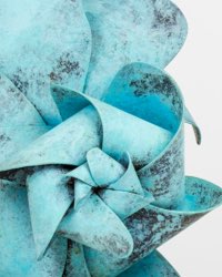
Sonia J. - "When Blue Becomes a Territory I" - XXXL


01
dia
08
horas
17
minutos
55
segundos
Licitação atual
€ 70
Preço de reserva não foi atingido

 | €70 | |
|---|---|---|
 | €65 | |
| €60 | |
Proteção do comprador da Catawiki
O seu pagamento está seguro connosco até receber o seu objeto.Ver detalhes
Trustpilot 4.4 | 141904 avaliações
Classificada como Excelente na Trustpilot.
Sonia J. apresenta uma obra original de 235 × 215 cm em acrílico sobre tela intitulada When Blue Becomes Territory I, assinada à mão, 2026, em excelente estado, azul-turquesa, tema Arquitetura.
Resumo assistido por IA
Descrição fornecida pelo vendedor
"When Blue Becames a the Territory I" : A compact field of turquoise acrylic in which vertical runs and earth-dark horizontal bands test how colour, gravity and abrasion can organise a wall.
— a 235cmHx215cmWx0,2cmD Full-painted acrylic-on-canvas study for
concentrated colour punctuation in intimate architectural settings.
ARTWORK INFORMATION
"When Blue Becames a the Territory I", is from the Atmosppheric Blue Series, 2026. Acrylic
ABOUT THIS ARTWORK
"When Blue Becames a the Territory I" is a large-scale-format acrylic painting built around an
active turquoise field, held in tension by muted grey-brown and rust-toned
passages. Rather than presenting a single even colour plane, the composition lets
the blue-green range vary in saturation and density: brighter cyan areas open
through the centre, while cloudier, more subdued zones gather toward the margins
and lower register. Its principal structure is vertical. Narrow runs descend from
the upper edge and continue through the central field, producing a measured,
gravity-led rhythm that keeps the surface from becoming purely atmospheric.
Against this downward movement, several irregular horizontal bands cross the work:
a substantial broken line occupies the middle, while denser, darker accumulations
build near the base. These lateral passages interrupt the vertical flow and give
the painting a low, weighted centre of gravity. The work operates as a focused
study in the artist’s ongoing attention to colour, matter, light, scale and
perception, and her principal research axis, Blue as Behaviour. Here, blue behaves
less as a stable backdrop than as a changing condition—sometimes lucid and open,
sometimes veiled by darker, particulate-looking acrylic passages. The image does
not resolve into a depicted scene; its interest lies in the negotiation between
pooling, dragging, staining and interruption.
FROM A DISTANCE
From a distance, the painting reads as a cool, luminous turquoise rectangle
crossed by darkened earth-grey bands. The central cyan zone carries the strongest
visual charge, while the lower third appears more compact and grounded. Fine
vertical lines create an almost rain-like cadence from top to bottom, but the
broad, broken horizontal passage through the middle prevents the composition from
feeling uniform or decorative. In a room, the work introduces a concentrated cool
note without requiring a large wall. Its blue-green field can sharpen pale
plaster, concrete, oak, dark metal or warm stone surroundings; the rust-brown
accents prevent the palette from reading as clinically clean. Viewed from several
metres away, the image is primarily an exercise in directional balance: descent,
interruption and accumulation.
AT CLOSE RANGE
At close range, the surface separates into layered acrylic behaviours. Thin
vertical drips and scratches reveal intervals of darker undertone, while broader
passages shift from translucent-looking veils to opaque, rougher-looking
concentrations. The central band has an uneven, dragged contour, with broken edges
and small interruptions that keep it from acting as a solid stripe. Along the
right side and lower section, stippled and granular-looking acrylic areas sit
beside smoother turquoise zones. Rust-brown marks appear intermittently at edges
and within the denser bands, creating a dry visual friction against the
wetter-looking blue passages. These details reward viewing at approximately arm’s
length; the work’s complexity is carried by variation in application rather than
by imagery.
MATERIALITY AND SURFACE
Recorded materials are acrylic paint on canvas. Visually, the painting uses
acrylic in contrasting states: thin, vertically mobile runs; broad brushed or
dragged areas; and denser, granular-looking passages, particularly at the right
and along the lower horizontal accumulation. These descriptions concern the
visible image only; no additional aggregate, sediment or non-acrylic material is
recorded. The canvas support is active in the reading of the work because the
paint does not fully erase the sense of a receptive, layered ground. Turquoise is
variously open, cloudy and obscured, while dark grey-brown and rust-like colour
notes seem to collect in irregular seams. The surface appears materially varied
rather than uniformly glossy or matte, so illumination should be selected to
reveal relief and tonal differences without producing distracting glare.
WHAT THE PAINTING CONTAINS
• A dominant turquoise to cyan acrylic field. • Fine vertical runs and linear drag
marks descending through the composition. • An irregular, dark grey-brown
horizontal band across the middle. • Denser lower-edge accumulations with muted
rust-brown notes. • Veiled, opaque and granular-looking acrylic applications. • No
figurative subject or specific depicted location is visually established. The work is suited to a substantial, uninterrupted wall or a carefully planned suspended installation where its height and breadth can be experienced together. A generous entrance hall, residential salon, hotel lounge, gallery room or corporate reception can accommodate its scale. Its blue field can establish a clear point of attention across the room, while the mineral surface gives viewers a reason to approach.
As a design starting point, allow a principal view from approximately 3–8 metres, with an accessible nearer position for examining the surface. The most effective setting supports both encounters. A long view alone loses material detail; furniture crowded against the work restricts the viewer’s relationship with its full height.
For architects and spatial designers:
Treat the 235 × 215 cm painted surface as a primary element in the spatial composition. Its near-square, vertically extended format can hold a broad wall plane, while the descending marks establish a relationship with columns, tall openings and the movement of people. The earth-toned lateral formations interrupt that vertical rhythm and give the surface structural weight. For an initial wall study, test a clear width of approximately 3.2– height around 3 metres or more gives useful scope for installation, lighting and separation from the ceiling. These are compositional starting points, to be tested against the actual room and mounting design. A suspended, unframed presentation has been developed for this work. It allows the canvas to occupy space with separation from the wall. The suspension, clearance and circulation should be designed around the actual support and weight. It should remain visually accessible without becoming an obstacle or an exposed contact surface.
For interior designers:
The supplied view combines luminous turquoise with mineral grey, brown and warmer earth-toned passages. Warm off-white plaster, limestone, travertine, restrained timber grain, linen, wool and dark metal offer useful palette tests. The warmer material elements can connect the blue to an interior without requiring repeated turquoise accessories. Give the painting a clear surrounding field and keep adjacent objects sufficiently low or distant to preserve the lower painted passages. In a residential setting, a dedicated wall beside a seating arrangement is a strong option. Placement above a sofa, console or fireplace must be checked in elevation: the work’s 235 cm height makes conventional above-furniture hanging difficult in rooms with ordinary ceiling heights.
For hospitality:
When Blue Becomes Territory is suited to a hotel arrival lounge, a generous reception, a library lounge or a substantial private suite where guests can see it from a distance and approach it during their stay. Its size can establish the identity of a room; the mineral inclusions provide a specific connection to the artist’s territory that can support a considered curatorial narrative. In hospitality proposals, position the painting within a clear sightline from arrival or seating, with enough space around it for its full surface to remain visible. Dry spa reception and relaxation areas may be considered where environmental conditions are suitable. Poolside walls, steam rooms and areas exposed to condensation are unsuitable. The intended experience is attentive and contemplative.
For collectors:
This work brings together the scale, material investigation and spatial ambition of Sónia Jerónimo’s blue paintings. The natural sand and Seia River sediments form part of the work’s physical substance. Its interest develops between the broad organisation of colour and the close reading of runs, accumulations and changes in surface density. For a collector, the relevant question is how the painting will inhabit the intended space over time. Consider viewing distance, available height, daylight and evening illumination together. The 235 × 215 cm dimensions describe the full painted surface; any proposed stretching or framing requires a separate assessment of the support and the resulting visible dimensions. Price, current availability and acquisition arrangements should be obtained directly from the studio.
For galleries and art consultants:
Present this as a large-scale material painting within Jerónimo’s investigation of blue as behaviour. Its strongest curatorial argument lies in the interaction of colour, sediment, gravity and bodily scale. The supplied view shows a luminous field interrupted by darker mineral passages; the work’s material origin gives those interruptions a physical connection to place. Client presentations should distinguish the painting’s own documentation from the artist’s general exhibition history. Include an accurate technical record, the complete frontal photograph when available, surface details and a measured installation study. Any exhibition claim for this exact work must be supported by its own record. The artist’s professional profile later in this document describes her wider practice.
For corporate and executive spaces:
A reception hall, executive lounge, boardroom anteroom or generous meeting space can give this work the distance and wall area it needs. The turquoise field establishes a strong visual presence within restrained stone, timber and acoustic finishes. Its material variation supports repeated viewing during daily use. Test the principal sightline from entrance and seating positions. Keep presentation screens, signage and reflective surfaces from competing with the painting, and locate it outside routes where chairs, luggage or service equipment could contact the canvas. Use a dedicated, dimmable lighting arrangement that remains effective during normal working hours.
Presentation and lighting:
The documented project presentation is a suspended vertical canvas, unframed and without a conventional stretcher. Develop its final installation with the artist and a professional art installer. Fixings, load distribution and the relationship between the canvas and its supports must be resolved for this particular object. Keep the complete painted surface visible wherever the presentation permits.
For a wall-related study displaying the full 235 cm height, a lower edge 25–35 cm above finished floor level places the upper edge at 260–270 cm and the centre at 142.5–152.5 cm. These dimensions are illustrative, before allowing for mounting components or a frame. Check the ceiling, lighting positions, public access and cleaning clearance before adopting them.
If a stretched or framed presentation is requested, assess the canvas edges and paint-bearing areas before specifying it. The full painted size must not automatically be presented as the finished stretched size. No depth, frame, mounting hardware or ready-to-hang status is established by the supplied photograph.
Recommended light conditions:
Begin the visual trial with dimmable, high-quality LED lighting around 3000 K. For a warmer residential or hospitality scheme, compare 2700 K on the actual painting. Choose CRI 90 or above and check the red-rendering value R9, ideally at least 50. Colour temperature is a display choice; it is not a measure of conservation safety.
Lighting reference — Canadian Conservation Institute, Technical Bulletin 36
At this scale, test a broad wall wash or overlapping beams for even coverage, with a modest lateral component to make surface relief legible. Avoid an intense central pool of light or grazing light that exaggerates every raised area. Review the result from the intended distant and near viewing positions. Set illuminance and display duration after assessing the actual pigments and mixed-media components. Light damage depends on both intensity and exposure time, and material sensitivity varies. Keep exposure as low as practicable for the intended viewing conditions, measure it at the painting and dim or switch off display lighting when it is unnecessary.
Avoid(!!)
Avoid direct sunlight, heat from radiators or active fireplaces, direct airflow from HVAC outlets, condensation and abrupt environmental changes. Keep hands, cleaning products and equipment away from the painted face. Surface cleaning, rolling, tensioning or changes to the mounting should be agreed with the artist and, where needed, a paintings conservator.
PHOTOGRAPHY & COLOUR ACCURACY:
The supplied photograph of When Blue Becomes Territory shows luminous turquoise and cyan, mineral grey, earth-brown formations and paler passages. Fine vertical runs cross areas of denser, granular-looking material. These observations describe the supplied view; exact colour, relief and condition should be assessed against the physical painting.
Screen settings, camera white balance, exposure and surrounding colours can alter the balance between turquoise and warmer mineral tones. Different light sources may change their relative prominence, while lateral illumination can reveal surface relief. Specific changes under daylight or warm artificial light should be checked on this work; a single photograph cannot establish them. The chromatic behaviour of the painting is part of the work itself. Its blues are designed to shift with light, distance and viewing angle.
ABOUT SONIA J. (1971, PORTUGAL)
Sonia J. (Jerónimo) is a Portuguese abstract artist whose practice emerges from a profound transition after more than three decades in executive leadership in the technology sector. Her work translates pressure, transformation, resilience and emotional intelligence into large- and medium-scale abstract paintings built through colour, rhythm, texture and material experimentation. Working with acrylics, gesso, sand, mineral texture and layered pigments, Sonia J. creates paintings that operate between atmospheric abstraction and architectural presence. Her works are designed not only to be seen, but to inhabit space - bringing depth, silence, movement and emotional gravity to interiors. Her artistic language is deeply connected to blue as a field of perception, memory and transformation. In her work, blue is not treated as a fixed colour, but as a living condition shaped by light, matter, scale and distance. It changes according to illumination, surface density, rhythm and spatial tension.
Sonia J.'s blues are often constructed through careful mixtures of primary colours and influenced by natural mineral references, including local river sediments, water erosion and the atmospheric conditions of the landscape around her. These blues behave differently across the surface: some areas appear aquatic and translucent, while others become darker, heavier, mineral and almost geological. Rather than using colour as decoration, she investigates how blue performs within space - how it absorbs light, reacts to texture, holds silence, creates depth and changes with the viewer's movement. Through matter, rhythm and sediment, blue becomes a perceptual and architectural experience.
Her work is directed towards collectors, architects, interior designers, hospitality spaces and contemplative environments where painting is understood as presence, not mere decoration on a wall.
PROFESSIONAL PROFILE, EXHIBITIONS & RECOGNITION
Her work has been presented internationally in exhibitions and art events including Port Gallery, Barcelona, for TOP Barcelona Prize 2026, with an official presentation at Museu Picasso, Barcelona; Consciousness at Palazzo Albrizzi-Capello, Venice, powered by ITSLIQUID Group and held parallel to the 61st Venice Biennale; Times Square Exhibition, New York, featuring Drift of Mineral Light, powered by Plogix Gallery; Galleria Sempione, Rome; MUST Museum, Southern Italy; Galleria Cael, Milan, for Gifts of Art | L'estetica del Dono; Galleria Art Spazio Tempo, Venice; the 1st International Braga Contemporary Art Exhibition, Portugal; and the 5th International Contemporary Art Fair by ITSLIQUID Group in Barcelona.
Her recognition includes selection for TOP Barcelona Prize 2026, finalist selection for the Premio Internazionale Artista d'Europa in Venice, Artist of the Month by ITSLIQUID Group, an interview with Luca Curci, CEO of ITSLIQUID Group, and inclusion among the Top 10 Berlin Contemporary Artists by BBA. Sonia J. is also listed in the AKOUN Art Price Database, with a High / Hausse tendency and a reference value of €1,200 for the 100 × 100 cm format.
Beyond exhibitions, her work has entered interior and architectural contexts, including an architectural premium loft installation in Barcelona in collaboration with Alpaca Studio, a spa installation in a four-star hotel in Verona, a restaurant installation in Monte Baldo, Verona, a lobby / entrance installation at Scuderia del Garda, Spiaggi, Verona, and installations in a healthcare centre and legal corporate office in Guarda, Portugal.
Her portfolio has been reviewed and discussed with international art professionals including Roberto Litta, International Art Curator for TOP Barcelona 2026 at Port Gallery and Galleria Sempione, Rome; Charlotte Paritzky, Director of Z&B Gallery and Co-Founder of OBRA Art; Quentin Métayer, PR & Communication at Perrotin; and Flavio Scaloni, Gallery Manager at Galerie Lo Scalo. Their feedback highlights her mastery of material, coherent use of gesture, texture and colour, and a renewed interpretation of the Action Painting tradition through a contemporary mineral and atmospheric language.
In situ visualisation note
In-situ visualisation accompanies this presentation. All simulation preserves the original artwork image, respect the confirmed height and width, and use measured architectural references. The mismatch between the supplied photograph and the physical aspect ratio was resolved before producing such a simulation.
Keywords:
Sónia Jerónimo; Sonia J.; When Blue Becomes Territory; Atmospheric Blue Series; blue as behaviour; large-scale abstract painting; acrylic and mixed media; Seia River sediments; cotton canvas; mineral surface; turquoise; material abstraction; painting and architecture; suspended painting; hospitality art; corporate art; Portugal.
"When Blue Becames a the Territory I" : A compact field of turquoise acrylic in which vertical runs and earth-dark horizontal bands test how colour, gravity and abrasion can organise a wall.
— a 235cmHx215cmWx0,2cmD Full-painted acrylic-on-canvas study for
concentrated colour punctuation in intimate architectural settings.
ARTWORK INFORMATION
"When Blue Becames a the Territory I", is from the Atmosppheric Blue Series, 2026. Acrylic
ABOUT THIS ARTWORK
"When Blue Becames a the Territory I" is a large-scale-format acrylic painting built around an
active turquoise field, held in tension by muted grey-brown and rust-toned
passages. Rather than presenting a single even colour plane, the composition lets
the blue-green range vary in saturation and density: brighter cyan areas open
through the centre, while cloudier, more subdued zones gather toward the margins
and lower register. Its principal structure is vertical. Narrow runs descend from
the upper edge and continue through the central field, producing a measured,
gravity-led rhythm that keeps the surface from becoming purely atmospheric.
Against this downward movement, several irregular horizontal bands cross the work:
a substantial broken line occupies the middle, while denser, darker accumulations
build near the base. These lateral passages interrupt the vertical flow and give
the painting a low, weighted centre of gravity. The work operates as a focused
study in the artist’s ongoing attention to colour, matter, light, scale and
perception, and her principal research axis, Blue as Behaviour. Here, blue behaves
less as a stable backdrop than as a changing condition—sometimes lucid and open,
sometimes veiled by darker, particulate-looking acrylic passages. The image does
not resolve into a depicted scene; its interest lies in the negotiation between
pooling, dragging, staining and interruption.
FROM A DISTANCE
From a distance, the painting reads as a cool, luminous turquoise rectangle
crossed by darkened earth-grey bands. The central cyan zone carries the strongest
visual charge, while the lower third appears more compact and grounded. Fine
vertical lines create an almost rain-like cadence from top to bottom, but the
broad, broken horizontal passage through the middle prevents the composition from
feeling uniform or decorative. In a room, the work introduces a concentrated cool
note without requiring a large wall. Its blue-green field can sharpen pale
plaster, concrete, oak, dark metal or warm stone surroundings; the rust-brown
accents prevent the palette from reading as clinically clean. Viewed from several
metres away, the image is primarily an exercise in directional balance: descent,
interruption and accumulation.
AT CLOSE RANGE
At close range, the surface separates into layered acrylic behaviours. Thin
vertical drips and scratches reveal intervals of darker undertone, while broader
passages shift from translucent-looking veils to opaque, rougher-looking
concentrations. The central band has an uneven, dragged contour, with broken edges
and small interruptions that keep it from acting as a solid stripe. Along the
right side and lower section, stippled and granular-looking acrylic areas sit
beside smoother turquoise zones. Rust-brown marks appear intermittently at edges
and within the denser bands, creating a dry visual friction against the
wetter-looking blue passages. These details reward viewing at approximately arm’s
length; the work’s complexity is carried by variation in application rather than
by imagery.
MATERIALITY AND SURFACE
Recorded materials are acrylic paint on canvas. Visually, the painting uses
acrylic in contrasting states: thin, vertically mobile runs; broad brushed or
dragged areas; and denser, granular-looking passages, particularly at the right
and along the lower horizontal accumulation. These descriptions concern the
visible image only; no additional aggregate, sediment or non-acrylic material is
recorded. The canvas support is active in the reading of the work because the
paint does not fully erase the sense of a receptive, layered ground. Turquoise is
variously open, cloudy and obscured, while dark grey-brown and rust-like colour
notes seem to collect in irregular seams. The surface appears materially varied
rather than uniformly glossy or matte, so illumination should be selected to
reveal relief and tonal differences without producing distracting glare.
WHAT THE PAINTING CONTAINS
• A dominant turquoise to cyan acrylic field. • Fine vertical runs and linear drag
marks descending through the composition. • An irregular, dark grey-brown
horizontal band across the middle. • Denser lower-edge accumulations with muted
rust-brown notes. • Veiled, opaque and granular-looking acrylic applications. • No
figurative subject or specific depicted location is visually established. The work is suited to a substantial, uninterrupted wall or a carefully planned suspended installation where its height and breadth can be experienced together. A generous entrance hall, residential salon, hotel lounge, gallery room or corporate reception can accommodate its scale. Its blue field can establish a clear point of attention across the room, while the mineral surface gives viewers a reason to approach.
As a design starting point, allow a principal view from approximately 3–8 metres, with an accessible nearer position for examining the surface. The most effective setting supports both encounters. A long view alone loses material detail; furniture crowded against the work restricts the viewer’s relationship with its full height.
For architects and spatial designers:
Treat the 235 × 215 cm painted surface as a primary element in the spatial composition. Its near-square, vertically extended format can hold a broad wall plane, while the descending marks establish a relationship with columns, tall openings and the movement of people. The earth-toned lateral formations interrupt that vertical rhythm and give the surface structural weight. For an initial wall study, test a clear width of approximately 3.2– height around 3 metres or more gives useful scope for installation, lighting and separation from the ceiling. These are compositional starting points, to be tested against the actual room and mounting design. A suspended, unframed presentation has been developed for this work. It allows the canvas to occupy space with separation from the wall. The suspension, clearance and circulation should be designed around the actual support and weight. It should remain visually accessible without becoming an obstacle or an exposed contact surface.
For interior designers:
The supplied view combines luminous turquoise with mineral grey, brown and warmer earth-toned passages. Warm off-white plaster, limestone, travertine, restrained timber grain, linen, wool and dark metal offer useful palette tests. The warmer material elements can connect the blue to an interior without requiring repeated turquoise accessories. Give the painting a clear surrounding field and keep adjacent objects sufficiently low or distant to preserve the lower painted passages. In a residential setting, a dedicated wall beside a seating arrangement is a strong option. Placement above a sofa, console or fireplace must be checked in elevation: the work’s 235 cm height makes conventional above-furniture hanging difficult in rooms with ordinary ceiling heights.
For hospitality:
When Blue Becomes Territory is suited to a hotel arrival lounge, a generous reception, a library lounge or a substantial private suite where guests can see it from a distance and approach it during their stay. Its size can establish the identity of a room; the mineral inclusions provide a specific connection to the artist’s territory that can support a considered curatorial narrative. In hospitality proposals, position the painting within a clear sightline from arrival or seating, with enough space around it for its full surface to remain visible. Dry spa reception and relaxation areas may be considered where environmental conditions are suitable. Poolside walls, steam rooms and areas exposed to condensation are unsuitable. The intended experience is attentive and contemplative.
For collectors:
This work brings together the scale, material investigation and spatial ambition of Sónia Jerónimo’s blue paintings. The natural sand and Seia River sediments form part of the work’s physical substance. Its interest develops between the broad organisation of colour and the close reading of runs, accumulations and changes in surface density. For a collector, the relevant question is how the painting will inhabit the intended space over time. Consider viewing distance, available height, daylight and evening illumination together. The 235 × 215 cm dimensions describe the full painted surface; any proposed stretching or framing requires a separate assessment of the support and the resulting visible dimensions. Price, current availability and acquisition arrangements should be obtained directly from the studio.
For galleries and art consultants:
Present this as a large-scale material painting within Jerónimo’s investigation of blue as behaviour. Its strongest curatorial argument lies in the interaction of colour, sediment, gravity and bodily scale. The supplied view shows a luminous field interrupted by darker mineral passages; the work’s material origin gives those interruptions a physical connection to place. Client presentations should distinguish the painting’s own documentation from the artist’s general exhibition history. Include an accurate technical record, the complete frontal photograph when available, surface details and a measured installation study. Any exhibition claim for this exact work must be supported by its own record. The artist’s professional profile later in this document describes her wider practice.
For corporate and executive spaces:
A reception hall, executive lounge, boardroom anteroom or generous meeting space can give this work the distance and wall area it needs. The turquoise field establishes a strong visual presence within restrained stone, timber and acoustic finishes. Its material variation supports repeated viewing during daily use. Test the principal sightline from entrance and seating positions. Keep presentation screens, signage and reflective surfaces from competing with the painting, and locate it outside routes where chairs, luggage or service equipment could contact the canvas. Use a dedicated, dimmable lighting arrangement that remains effective during normal working hours.
Presentation and lighting:
The documented project presentation is a suspended vertical canvas, unframed and without a conventional stretcher. Develop its final installation with the artist and a professional art installer. Fixings, load distribution and the relationship between the canvas and its supports must be resolved for this particular object. Keep the complete painted surface visible wherever the presentation permits.
For a wall-related study displaying the full 235 cm height, a lower edge 25–35 cm above finished floor level places the upper edge at 260–270 cm and the centre at 142.5–152.5 cm. These dimensions are illustrative, before allowing for mounting components or a frame. Check the ceiling, lighting positions, public access and cleaning clearance before adopting them.
If a stretched or framed presentation is requested, assess the canvas edges and paint-bearing areas before specifying it. The full painted size must not automatically be presented as the finished stretched size. No depth, frame, mounting hardware or ready-to-hang status is established by the supplied photograph.
Recommended light conditions:
Begin the visual trial with dimmable, high-quality LED lighting around 3000 K. For a warmer residential or hospitality scheme, compare 2700 K on the actual painting. Choose CRI 90 or above and check the red-rendering value R9, ideally at least 50. Colour temperature is a display choice; it is not a measure of conservation safety.
Lighting reference — Canadian Conservation Institute, Technical Bulletin 36
At this scale, test a broad wall wash or overlapping beams for even coverage, with a modest lateral component to make surface relief legible. Avoid an intense central pool of light or grazing light that exaggerates every raised area. Review the result from the intended distant and near viewing positions. Set illuminance and display duration after assessing the actual pigments and mixed-media components. Light damage depends on both intensity and exposure time, and material sensitivity varies. Keep exposure as low as practicable for the intended viewing conditions, measure it at the painting and dim or switch off display lighting when it is unnecessary.
Avoid(!!)
Avoid direct sunlight, heat from radiators or active fireplaces, direct airflow from HVAC outlets, condensation and abrupt environmental changes. Keep hands, cleaning products and equipment away from the painted face. Surface cleaning, rolling, tensioning or changes to the mounting should be agreed with the artist and, where needed, a paintings conservator.
PHOTOGRAPHY & COLOUR ACCURACY:
The supplied photograph of When Blue Becomes Territory shows luminous turquoise and cyan, mineral grey, earth-brown formations and paler passages. Fine vertical runs cross areas of denser, granular-looking material. These observations describe the supplied view; exact colour, relief and condition should be assessed against the physical painting.
Screen settings, camera white balance, exposure and surrounding colours can alter the balance between turquoise and warmer mineral tones. Different light sources may change their relative prominence, while lateral illumination can reveal surface relief. Specific changes under daylight or warm artificial light should be checked on this work; a single photograph cannot establish them. The chromatic behaviour of the painting is part of the work itself. Its blues are designed to shift with light, distance and viewing angle.
ABOUT SONIA J. (1971, PORTUGAL)
Sonia J. (Jerónimo) is a Portuguese abstract artist whose practice emerges from a profound transition after more than three decades in executive leadership in the technology sector. Her work translates pressure, transformation, resilience and emotional intelligence into large- and medium-scale abstract paintings built through colour, rhythm, texture and material experimentation. Working with acrylics, gesso, sand, mineral texture and layered pigments, Sonia J. creates paintings that operate between atmospheric abstraction and architectural presence. Her works are designed not only to be seen, but to inhabit space - bringing depth, silence, movement and emotional gravity to interiors. Her artistic language is deeply connected to blue as a field of perception, memory and transformation. In her work, blue is not treated as a fixed colour, but as a living condition shaped by light, matter, scale and distance. It changes according to illumination, surface density, rhythm and spatial tension.
Sonia J.'s blues are often constructed through careful mixtures of primary colours and influenced by natural mineral references, including local river sediments, water erosion and the atmospheric conditions of the landscape around her. These blues behave differently across the surface: some areas appear aquatic and translucent, while others become darker, heavier, mineral and almost geological. Rather than using colour as decoration, she investigates how blue performs within space - how it absorbs light, reacts to texture, holds silence, creates depth and changes with the viewer's movement. Through matter, rhythm and sediment, blue becomes a perceptual and architectural experience.
Her work is directed towards collectors, architects, interior designers, hospitality spaces and contemplative environments where painting is understood as presence, not mere decoration on a wall.
PROFESSIONAL PROFILE, EXHIBITIONS & RECOGNITION
Her work has been presented internationally in exhibitions and art events including Port Gallery, Barcelona, for TOP Barcelona Prize 2026, with an official presentation at Museu Picasso, Barcelona; Consciousness at Palazzo Albrizzi-Capello, Venice, powered by ITSLIQUID Group and held parallel to the 61st Venice Biennale; Times Square Exhibition, New York, featuring Drift of Mineral Light, powered by Plogix Gallery; Galleria Sempione, Rome; MUST Museum, Southern Italy; Galleria Cael, Milan, for Gifts of Art | L'estetica del Dono; Galleria Art Spazio Tempo, Venice; the 1st International Braga Contemporary Art Exhibition, Portugal; and the 5th International Contemporary Art Fair by ITSLIQUID Group in Barcelona.
Her recognition includes selection for TOP Barcelona Prize 2026, finalist selection for the Premio Internazionale Artista d'Europa in Venice, Artist of the Month by ITSLIQUID Group, an interview with Luca Curci, CEO of ITSLIQUID Group, and inclusion among the Top 10 Berlin Contemporary Artists by BBA. Sonia J. is also listed in the AKOUN Art Price Database, with a High / Hausse tendency and a reference value of €1,200 for the 100 × 100 cm format.
Beyond exhibitions, her work has entered interior and architectural contexts, including an architectural premium loft installation in Barcelona in collaboration with Alpaca Studio, a spa installation in a four-star hotel in Verona, a restaurant installation in Monte Baldo, Verona, a lobby / entrance installation at Scuderia del Garda, Spiaggi, Verona, and installations in a healthcare centre and legal corporate office in Guarda, Portugal.
Her portfolio has been reviewed and discussed with international art professionals including Roberto Litta, International Art Curator for TOP Barcelona 2026 at Port Gallery and Galleria Sempione, Rome; Charlotte Paritzky, Director of Z&B Gallery and Co-Founder of OBRA Art; Quentin Métayer, PR & Communication at Perrotin; and Flavio Scaloni, Gallery Manager at Galerie Lo Scalo. Their feedback highlights her mastery of material, coherent use of gesture, texture and colour, and a renewed interpretation of the Action Painting tradition through a contemporary mineral and atmospheric language.
In situ visualisation note
In-situ visualisation accompanies this presentation. All simulation preserves the original artwork image, respect the confirmed height and width, and use measured architectural references. The mismatch between the supplied photograph and the physical aspect ratio was resolved before producing such a simulation.
Keywords:
Sónia Jerónimo; Sonia J.; When Blue Becomes Territory; Atmospheric Blue Series; blue as behaviour; large-scale abstract painting; acrylic and mixed media; Seia River sediments; cotton canvas; mineral surface; turquoise; material abstraction; painting and architecture; suspended painting; hospitality art; corporate art; Portugal.
Dados
Artista
Sonia J.
Edição
Original
Vendido por
Vindo diretamente do artista
Vendido com moldura
Não
Título da obra de arte
"When Blue Becomes a Territory I" - XXXL
Técnica
Técnica mista
Assinatura
Assinado à mão
País de origem
Portugal
Ano
2026
Estado
Excelente estado
Cor
Azul
Altura
235 cm
Largura
215 cm
Peso
5 g
Imagem/Tema
Arquitetura
Estilo
Abstrato
Período
Depois de 2020
Vendido por