No. 103957671
No. 103957671
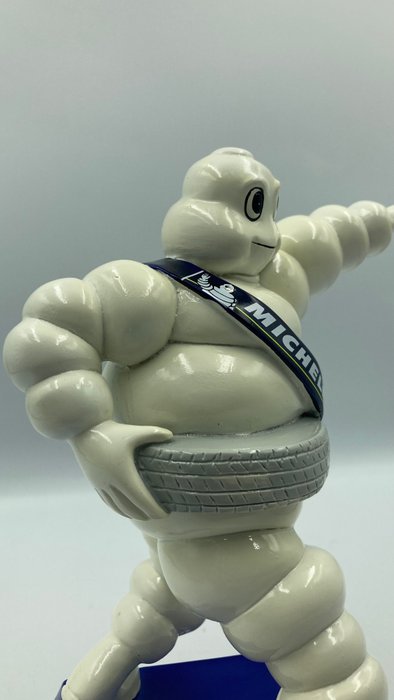
Omino Michelin,oggetto pubblicitario
Scultura in resina Michelin
nuovo con confezione
Spedizione tracciata
imballo accurato
con protezione in gommapiuma
Michelin omino in resina, grandi dimensioni rispetto a gadget che veniva regalato con gli acquisti dei pneumatici
Questo era in dotazione alle officine come forma pubblicitaria
Cenni storici:
Durante la partecipazione all'Esposizione Universale e Coloniale di Lione nel 1894, Édouard e André Michelin notarono una pila di pneumatici che suggerì a Édouard la figura di un uomo senza braccia. Quattro anni dopo, nel 1898, André incontrò il fumettista francese Marius Rossillon, popolarmente noto come O'Galop, che gli mostrò un'immagine che aveva creato per un birrificio di Monaco che era stata rifiutata. Esso rappresentava una grande figura umana che regge un bicchiere di birra e la frase di Orazio Nunc est bibendum ("Adesso è il momento di bere"André suggerì di sostituire l'uomo con una figura fatta di pneumatici, simile alla pila vista anni prima; O'Galop trasformò quindi l'immagine originale in quello che diverrà il simbolo della Michelin.
Il primo manifesto del 1898 lo ritraeva mentre offriva un brindisi ai suoi miseri concorrenti con la frase Nunc est bibendum, con in mano un bicchiere pieno di pericolosi chiodi e vetri rotti, mentre pronuncia la frase "C'est à dire: À votre santé. Le pneu Michelin boit l'obstacle" ("Vale a dire: alla vostra salute. Il pneumatico Michelin beve gli ostacoli"). [1] L'implicazione era che gli pneumatici Michelin avrebbero superato facilmente i pericoli stradali al contrario degli altri pneumatici.
Bibendum in versione moderna, esposto ad una fiera a Taipei nel 2008.
L'azienda ha utilizzato questo tipo di poster come base per parecchi anni, aggiungendo i suoi ultimi prodotti al tavolo davanti alla figura. Non è chiaro quando la parola "Bibendum" sia diventata il nome del personaggio stesso. Nel 1908 la Michelin commissionò a Curnonsky la redazione di una colonna di giornale firmata "Bibendum". Negli anni '20, "Bibendum" era anche il titolo di un periodico edito dalla filiale italiana dell'azienda.[2]
Nel 1922, la Michelin organizzò un concorso per "nominare il Michelin Tyre Man" negli Stati Uniti. [3]
La forma del Bibendum è cambiata negli anni, aggiornandosi nel secondo dopoguerra per renderlo più in linea con le nuove esigenze pubblicitarie. Il logo di O'Galop era basato su pneumatici per biciclette, indossava occhiali pince-nez con il cordino e fumava un sigaro. Negli anni '70 e '80, Bibendum veniva mostrato in corsa e nel 1998, il suo centesimo anniversario, una versione ridotta divenne il nuovo logo dell'azienda. Aveva rinunciato da molti anni al sigaro e al pince-nez. Lo snellimento del logo rifletteva gli pneumatici più piccoli e di basso profilo delle auto moderne e conferiva al personaggio un'aria più cordiale e affabile.
#salvagecollection
How to buy on Catawiki
1. Discover something special
2. Place the top bid
3. Make a secure payment